
Creating a great app is just the beginning; getting users to download it is the real challenge. One of the most overlooked but powerful tools in your arsenal? Your app store screenshots.
These images are not just decorative. They are decision-makers. In a matter of seconds, users scan your screenshots to judge whether your app is worth their time. If done right, they can boost conversions, tell a compelling story, and highlight your app’s actual value without a single word of code.
Why Do App Store Screenshots Matter?
App store screenshots are often the first thing potential users see. These visuals can make or break an app’s success in the store. Here’s why they are crucial:
- First Impressions Count: Screenshots provide an immediate visual impression of your app’s functionality and user interface. A clean, attractive design can spark curiosity and encourage users to download.
- Highlight Key Features: Use screenshots to showcase your app’s core features. It gives users a clear understanding of what your app offers and how it can meet their needs.
- Boost Conversion Rates: Well-crafted screenshots directly impact conversion rates. A study shows that apps with engaging, high-quality visuals tend to see a higher number of installs.
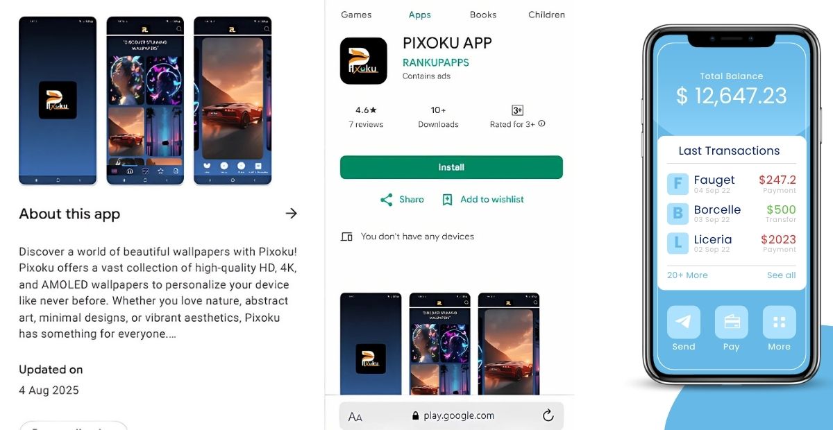
- Build Trust: Real screenshots (rather than mockups) show users exactly what to expect. This transparency builds trust and reduces the risk of uninstalls after downloading.
- Showcase Updates and Improvements: Regularly updated screenshots reflect new features or designs, keeping your app fresh and relevant in users’ minds.
Incorporating these strategies can significantly improve your app’s visibility and downloads.
App Store Screenshot Guidelines by Platform
When it comes to app marketing, screenshots are your first impression. These visuals help users decide whether to download your app or not. Properly optimized screenshots are crucial in capturing attention and driving downloads. Below are the key guidelines for app store screenshots, tailored to each platform so that you can make the most of these important assets.
App Store Screenshot Guidelines by Platform
| Platform | Ideal Image Size | Aspect Ratio | Text Overlays | Key Feature Highlight | Device Frames |
| Apple App Store | 1242 x 2208 px (iPhone) | 16:9 | Minimal | User Engagement | Yes |
| Google Play Store | 320 px – 3840 px | 16:9 | Minimal/Concise | User Interface/Function | No |
| Amazon Appstore | 1280 x 720 px | 16:9 | Brief Text | Core Features | Optional |
| Microsoft Store | 1920 x 1080 px | 16:9 | Simple Text | App Usability | No |
| Huawei AppGallery | 800 x 800 px to 1920 x 1080 px | 16:9 | Minimal | Core App Features | Optional |
Key Points to Remember
- Consistency is Key: Ensure your app screenshots are visually consistent across all platforms. IT creates a professional, cohesive experience.
- Focus on Features: Prioritize the most important and engaging features to highlight in your screenshots.
- Be Device-Specific: Tailor your screenshots to fit the platform’s specific device types (mobile, tablet, desktop).
- Minimal Text: Keep text minimal and to the point. It should enhance the visual experience, not overwhelm it.
- Regular Updates: Keep your screenshots up-to-date with the latest version of your app.
One-Liner Points
- Quality screenshots play a major role in converting app browsers into downloads.
- Each platform has its unique requirements for app store screenshots.
- Focus on showcasing your app’s main functionality in every screenshot.
- Avoid cluttering screenshots with excessive text; keep it clear and simple.
- Regularly update screenshots to ensure they reflect the latest app features.
By following these guidelines, you can ensure that your app stands out on the app stores and resonates with users, leading to increased downloads and user engagement.
Design Principles for High-Converting Screenshots
Creating high-converting app screenshots is crucial for attracting users in the crowded app marketplace. To make your screenshots stand out, follow these key design principles:
Focus on Core Features
Highlight the main features that set your app apart. Users should instantly understand the value your app offers. Use clear images that show the most engaging and unique functionalities.
Keep It Simple
Don’t overcrowd your screenshots with too much text or imagery. Minimalistic designs with bold, concise captions perform better. Users want to see how the app works at a glance, without unnecessary distractions.
Use Consistent Branding
Make sure the colors, fonts, and style reflect your brand identity. Consistency creates a professional look and ensures that your app feels familiar across all user touchpoints.
Show Real-World Use Cases
Demonstrate your app in action. Whether it’s a task being completed or a feature solving a problem, showcasing real-world use helps potential users relate to your app and visualize how it fits into their daily lives.
Strategic Order and Flow
Your app store screenshots are not just static images; they’re a guided tour. The order in which you present them shapes how users perceive your app, feature by feature. A well-planned screenshot flow can make the difference between a scroll-past and a download..
Tell a Story from First to Last
When users scroll through your app store screenshots, they are not just glancing at images; they are walking through your product’s story. It is your chance to guide them through your app’s features and explain why they matter.
Maintain Visual Consistency
Visual consistency is the backbone of a compelling screenshot sequence. When each image follows a cohesive style, the same colour palette, typography, and layout, it creates a seamless viewing experience. Users can quickly understand the app’s flow and focus on what matters: your app’s value.
Localization and A/B Testing
Localization and A/B testing are two crucial strategies for optimizing app performance across different markets. Here’s how they work together to improve user engagement and conversion rates:
- Targeting Specific Audiences: Localization adapts the app’s content, language, and cultural elements for a particular region. It ensures that users feel at home, which increases engagement. For example, a gaming app might offer region-specific features or language options to connect better with local users.
- Enhanced User Experience: By tailoring the app experience to meet local preferences, users are more likely to enjoy seamless interaction. A/B testing allows you to test different localized versions, ensuring the one that resonates most with users is implemented.
- Improving Conversion Rates: Localization paired with A/B testing helps find the right messaging, pricing, and design for each market. Testing variations like button placement or color schemes can boost conversion rates significantly.
- Real-Time Insights: A/B testing provides immediate feedback, letting you refine localization strategies based on real user data. It reduces the guesswork and helps make data-driven decisions.
- Increased ROI: By localizing and optimizing the app for each audience, you ensure that marketing and development budgets are used efficiently, leading to higher returns in each region.
Conclusion – Turning Viewers into Users with Smart Screenshots
In a crowded app marketplace, your screenshots are not just visuals; they are conversion tools. When users scroll through app stores, they decide in seconds whether to explore further or move on. That split-second decision is heavily influenced by what they see first: your screenshots.
By following app store screenshots best practices, you turn passive viewers into active users. Clean layouts, localized content, and feature-focused visuals build trust and curiosity. Whether it’s a finance app showing a smooth onboarding flow or a game highlighting action-packed scenes, screenshots should instantly communicate value.
Think of your screenshot gallery as a pitch deck; the first few slides must hook attention. If done right, they can boost install rates, increase user confidence, and set the tone for a great in-app experience.